Styling and Design
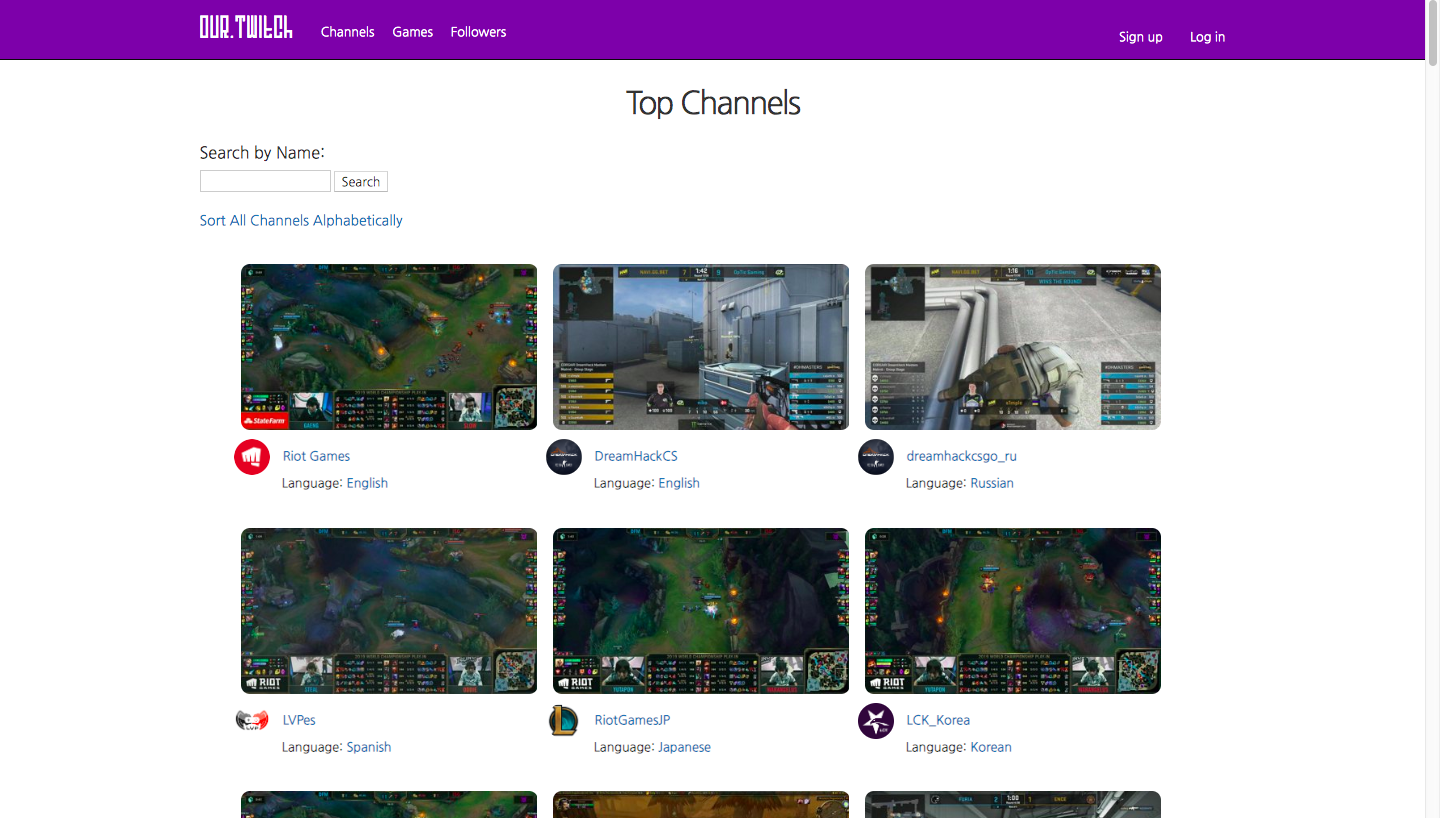
My partners and I felt that the original Twitch website was a little messy and jumbled, so we designed our application to feel simple in design and easy to understand. We incorporated the same color schema as the original site, to 'mimic' the feeling that you were still watching Twitch, just on a different platform. When designing the channel and games container layout, we chose a grid layout to make it look like an organized list.
When designing the User and Follower feature, we first had to decide how we wanted to format it. We ended up going with a simple User search feature, where any user can find any other one, and allow the main user to see what kinds of channels they have been watching. This would allow users to explore channels through other people's preferences, instead of having to scrape the website to find an interesting one by themselves.
Technical Process
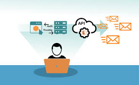
We seeded all of our data from the Twitch API. One of the issues with this was that it would only list the active live channels, so everytime a new channel that wasn't in the database came online, we would have to immediately create a new channel object for it. This was the same case for the game objects. The twitch livestream was loaded through an iframe, and recommended channels were configured based on the same game or the same language as the one on screen.
Here's some issues we faced during development:
- The app would crash after a channel being deleted from the database after being banned.
- A channel belonged to a game, but in some cases, some channels were streaming without a game id.
- After entering a channel's page, sometimes the stream would not come up until a refresh.
- The data for loading all of the streams was very large, so we had to create queries to load only a couple at once.
- The Twitch API was undergoing a version update when we were creating this, so we had to account for some deprecated endpoints.